Create a new report template
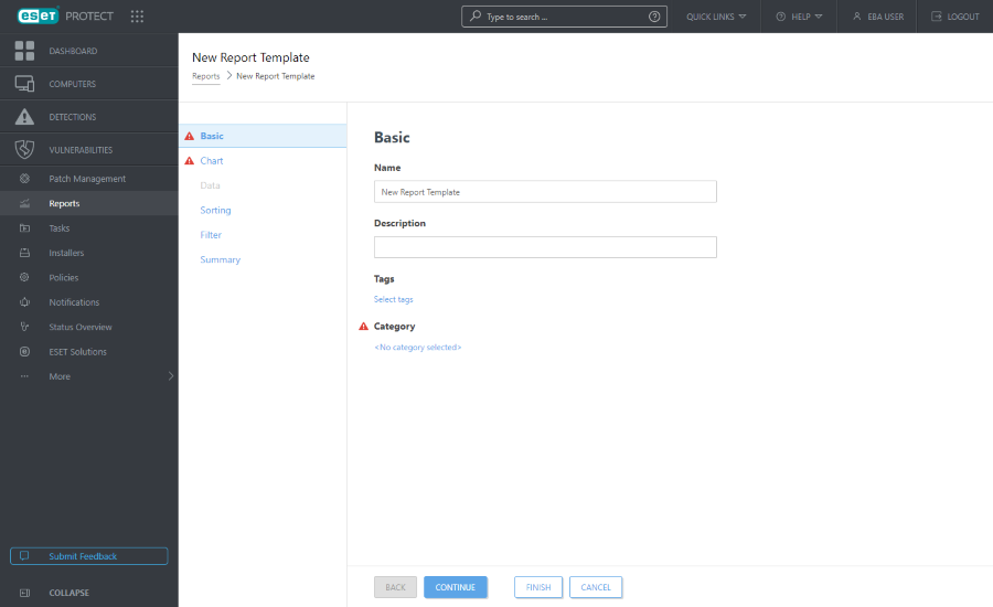
Navigate to Reports and click New Report Template.

Basic
Edit the Basic information about the Template. Type a Name, Description and Category. You can only choose from pre-defined Categories. If you want to create a new category, use the New Category option (described in the previous chapter). Click Select tags to assign tags.

Chart
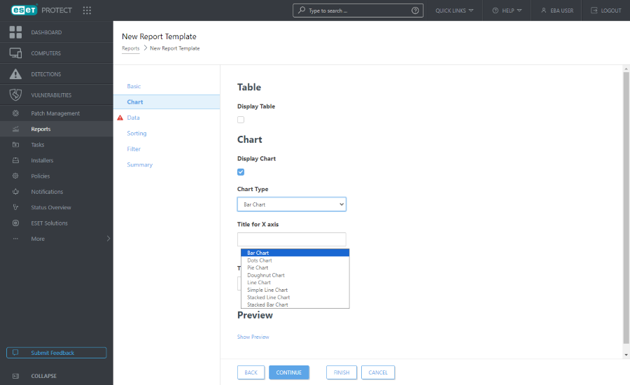
In the Chart section, select the Report type. Either a Table, where the information is sorted in rows and columns, or a Chart that represents data using an X and Y axis.
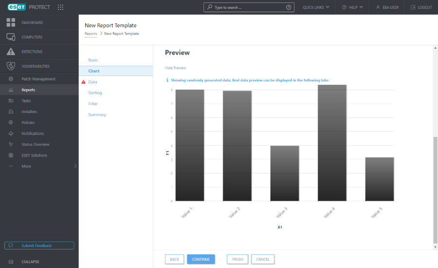
The selected chart type will be displayed in the Preview section. This way, you can see what the report will look like in real-time. |
Selecting a Chart gives you multiple options:
•Bar Chart - A chart with rectangular bars proportional to the values they represent.
•Dots Chart - In this chart, dots are used to display quantitative values (similar to a bar chart).
•Pie Chart - A pie chart is a circular chart divided into proportional sectors, representing values.
•Doughnut Chart - Similar to a pie chart, but the doughnut chart can contain multiple types of data.
•Line Chart - Displays information as a series of data points connected by straight line segments.
•Simple Line Chart - Displays information as a line based on values without visible data points.
•Stacked Line Chart - This chart type is used when you want to analyze data with different units of measure.
•Stacked Bar Chart - Similar to a simple bar chart, but there are multiple data types with different units of measure stacked in the bars.
Optionally, you can type a title for the X and Y axis of the chart to make it easier to read the chart and recognize trends.

Data
In the Data section, select the information you want to display:
a.Table Columns: Information for the table is added automatically based on the selected report type. You can customize the Name, Label and Format (see below).
b.Chart Axes: Select the data for the X and the Y axis. Clicking the Add Axis opens a window with options. The choices available for the Y axis always depend on the information selected for the X axis and vice versa, because the chart displays their relation and the data must be compatible with the structure of the ESET PROTECT database. Select the desired information and click OK.
Format
Click the ![]() symbol in the Data section to see extended formatting options. You can change the Format in which the data is displayed. You can adjust formatting for Table Columns and Chart Axes. Not all options are available for each data type.
symbol in the Data section to see extended formatting options. You can change the Format in which the data is displayed. You can adjust formatting for Table Columns and Chart Axes. Not all options are available for each data type.
Format Column |
Choose a column according to which the current column will be formatted. For example, when formatting Name column, choose Severity column to add severity icons next to the names. |
Minimal Value |
Set the minimal limit for the displayed values. |
Maximal Value |
Set the maximum limit for the displayed values. |
Color |
Choose the color scheme for the column. Color is adjusted according to the value of the column picked in the Format Column. |
Icons |
|
Click one of the arrows ![]()
![]() to change the order of the columns.
to change the order of the columns.
Sorting
If the data selected in the Data section contains a sortable symbol, sorting is available. Click Add Sorting to define the relationship between the selected data. Select the starting information (sorting value) and sorting method, either Ascending or Descending. This will define the outcome displayed in the chart. Click Up or Down to change the order of the sorting elements. Click the trash icon ![]() to remove the element from the selection.
to remove the element from the selection.
Filter
Define the filtering method. Click Add Filter and select the filtering element from the list and its value. This defines what information will be displayed in the chart. Click the trash icon ![]() to remove the element from the selection.
to remove the element from the selection.
Summary
In the Summary, review the selected options and information. Click Finish to create a new report template.